

Most web pages are built from rows and columns: a header across the top, a sidebar beside the main content, a gallery of cards. CSS Grid layout is the tool made for exactly that job. You describe the rows and columns in your stylesheet, then drop elements into them.
This guide shows how to create a grid, size its tracks, place items, name areas and build a gallery that adapts to the screen without a single media query.
Table of Contents
What Is CSS Grid Layout?
Grid is a CSS layout system that works in two dimensions at the same time: rows and columns. You define the grid on a parent element, and its children line up inside it.
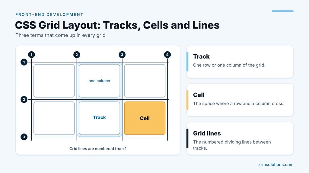
Three terms come up often. A track is one row or one column. A cell is the space where a row and a column cross. Grid lines are the numbered dividing lines between tracks.
Creating a Grid Container
Any element becomes a grid container when you give it display: grid. Its direct children become grid items automatically.
.grid {
  display: grid;
  grid-template-columns: 200px 200px 200px;
  grid-template-rows: 100px 100px;
  gap: 16px;
}grid-template-columnstakes one value per column. Three values create three columns.grid-template-rowsdoes the same for rows.gapadds space between tracks, but not around the outer edge. Two values, such asgap: 16px 24px, set the row gap first and the column gap second.
Only direct children are grid items. Elements nested deeper are not affected.
The fr Unit and repeat()
Fixed pixel columns do not adapt to the screen. The fr unit fixes that. One fr is one share of the free space left in the container.
With grid-template-columns: 1fr 2fr, the second column is twice as wide as the first. You can also mix units: 250px 1fr gives a fixed sidebar and a main column that takes the rest.
When several tracks share a size, repeat() saves typing:
.grid {
  display: grid;
  grid-template-columns: repeat(3, 1fr);
  gap: 16px;
}
This is the same as writing 1fr 1fr 1fr: three equal columns.
Placing Items with grid-column and grid-row
By default, items fill the grid one cell at a time, left to right and top to bottom. To change that, point an item at grid lines. Lines are numbered from 1, so a three-column grid has four column lines.
.featured {
  grid-column: 1 / 3;
  grid-row: 1 / 2;
}
.wide {
  grid-column: span 2;
}
.full {
  grid-column: 1 / -1;
}
1 / 3means start at line 1 and end at line 3, so the item covers two columns.span 2means stretch across two tracks from wherever the item lands.-1is the last line, so1 / -1covers the full width.
Naming Regions with grid-template-areas
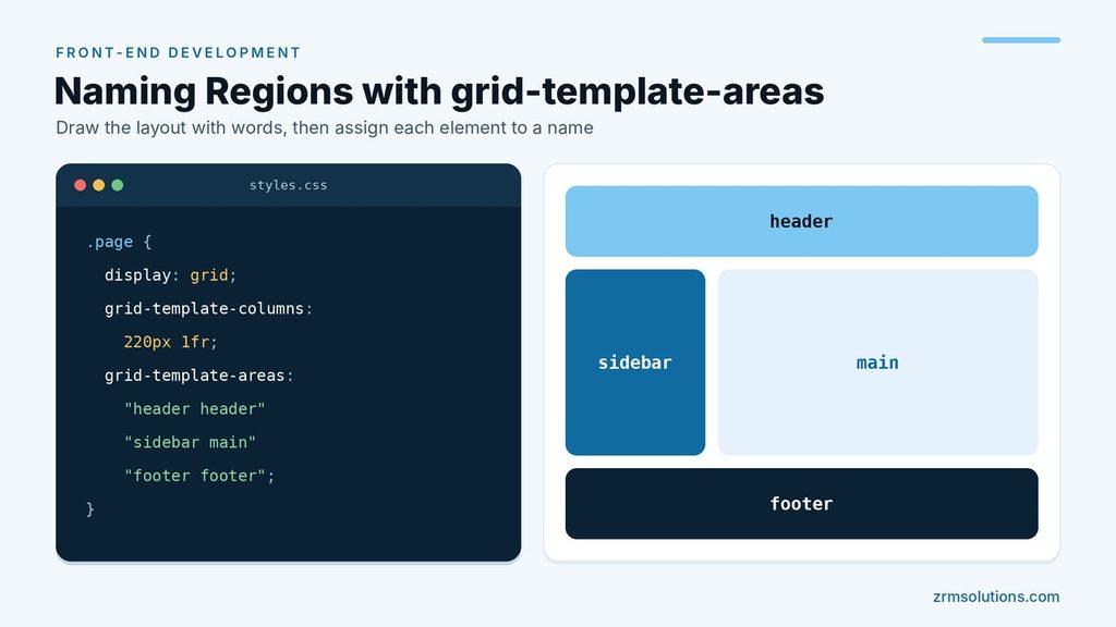
Line numbers work, but named areas are easier to read. You draw the layout with words, then assign each element to a name.
.page {
  display: grid;
  grid-template-columns: 220px 1fr;
  grid-template-areas:
    "header header"
    "sidebar main"
    "footer footer";
}
.page header { grid-area: header; }
.page aside { grid-area: sidebar; }
.page main { grid-area: main; }
.page footer { grid-area: footer; }
Each quoted string is one row, and each word is one cell. Repeating a name makes that area span several cells. A period (.) marks an empty cell.
Responsive Grids with auto-fit and minmax()
One line of CSS can produce a gallery that changes its column count on its own:
.gallery {
  display: grid;
  grid-template-columns: repeat(auto-fit, minmax(220px, 1fr));
  gap: 16px;
}
minmax(220px, 1fr) says each column must be at least 220 pixels wide and may grow to share the leftover space. auto-fit tells the browser to create as many of those columns as fit in the row.
On a wide monitor you might get five cards per row, on a tablet three, and on a phone one. No media query is involved.
Implicit Rows
When cards wrap like this, or when you define two rows but add enough items for four, Grid does not break. It creates the extra rows for you. These are called implicit rows.
By default, implicit rows are only as tall as their content. To control them, use grid-auto-rows. For example, grid-auto-rows: 150px makes every extra row 150 pixels tall, and grid-auto-rows: minmax(150px, auto) sets a minimum height while still letting long content grow.
Aligning Items Inside Their Cells
Items stretch to fill their cells unless you say otherwise. Three container properties control this:
justify-itemsaligns items horizontally inside their cells.align-itemsaligns them vertically.place-itemssets both at once.
Each accepts start, end, center or stretch. The well-known way to center content both ways is place-items: center.
Flexbox vs Grid: When to Pick Each
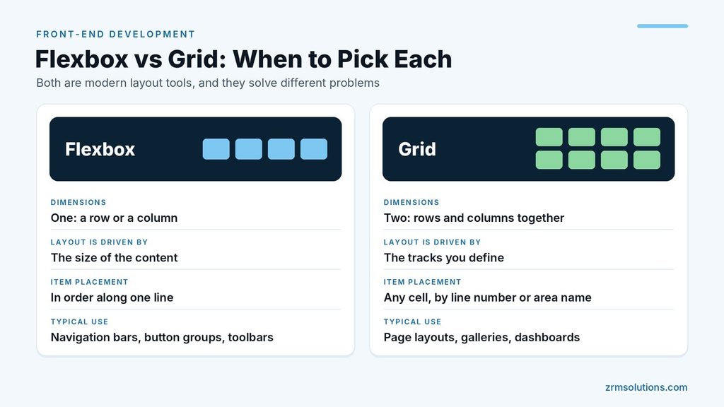
Both are modern layout tools, and they solve different problems.
| Flexbox | Grid | |
|---|---|---|
| Dimensions | One: a row or a column | Two: rows and columns together |
| Layout is driven by | The size of the content | The tracks you define |
| Item placement | In order along one line | Any cell, by line number or area name |
| Typical use | Navigation bars, button groups, toolbars | Page layouts, galleries, dashboards |
Pick Grid when you need to line things up in both directions. Pick Flexbox when you have a single row or column of items that should share space.
Most real pages use both: Grid for the page structure, Flexbox inside smaller components. Flexbox properties are covered in CSS Flexbox Explained.
Frequently Asked Questions
Do I need to learn Flexbox before CSS Grid?
No. The two systems are independent, so you can learn them in either order. Most developers end up using both.
Is CSS Grid supported in all browsers?
Yes. Chrome, Firefox, Safari and Edge have all supported Grid for years.
What is the difference between auto-fit and auto-fill?
Both create as many columns as fit. With auto-fit, empty columns collapse and the items stretch to fill the row. With auto-fill, the empty columns keep their space.
Explicit and Implicit Grids
Every CSS Grid layout has two parts. The explicit grid is the set of rows and columns you define with grid-template-columns and grid-template-rows. The implicit grid is whatever the browser adds when there are more items than cells.
Three properties control the implicit part:
- grid-auto-rows sets the height of rows the browser creates.
- grid-auto-columns sets the width of columns the browser creates.
- grid-auto-flow decides where the next item goes.
.grid {
  display: grid;
  grid-template-columns: repeat(3, 1fr);
  grid-auto-rows: 120px;
  grid-auto-flow: dense;
}
The default flow is row, which fills each row from left to right before starting the next. column fills downward first. Adding dense tells the browser to go back and fill any gaps left by wide items. That makes a tidy gallery, but it can show items in a different order from the HTML, so avoid it when the order of the content matters.
Track Sizes: auto, min-content, max-content and minmax()
Pixels and the fr unit are not the only ways to size a track. Four other values let the content decide.
- auto sizes a track to fit its content. If there are no fr tracks, auto tracks also share any leftover space.
- min-content makes the track as narrow as its content allows, which for text means the width of the longest word.
- max-content makes the track as wide as its content wants, with no line breaks.
- minmax(min, max) sets a lower and an upper limit, and the browser picks a size between them.
.row {
  display: grid;
  grid-template-columns: max-content 1fr auto;
}
In this row the first column is exactly as wide as its label, the last column fits its button, and the middle column takes everything that is left.
One detail about the fr unit saves a lot of confusion. A 1fr column will not shrink below the smallest size its content can take. A wide image, a long link or a block of code can therefore push the column, and the whole page, wider than the screen. Writing the track as minmax(0, 1fr) removes that limit and lets the column shrink.
Aligning the Whole Grid Inside Its Container
When the tracks have fixed sizes, they may not fill the container. Two properties decide what happens to the spare room.
- justify-content moves or spreads the columns horizontally.
- align-content moves or spreads the rows vertically.
Both accept start, center, end, space-between, space-around and space-evenly, and place-content sets the two together.
The names are easy to mix up with the ones from the alignment section above. The properties that end in items position each item inside its own cell. The properties that end in content position the tracks inside the container. To change a single item, use justify-self, align-self or place-self on that item.
Overlapping Items
Grid items are allowed to share cells, which makes layered designs simple. Place two items on the same lines and they sit on top of each other.
.hero {
  display: grid;
}

.hero img,
.hero .caption {
  grid-area: 1 / 1;
}

.hero .caption {
  align-self: end;
  z-index: 1;
}
The image and the caption both occupy the single cell of the grid, and the caption is aligned to the bottom of it. The item that comes later in the HTML is drawn on top by default, and z-index changes that order. No absolute positioning is needed, so the container still grows with its content.
The grid-area Shorthand and Negative Lines
grid-area can name a region, as shown earlier, and it can also set all four lines in one declaration. The order is row start, column start, row end, column end.
.sidebar {
  grid-area: 1 / 1 / 3 / 2;
}
This sidebar starts at row line 1 and column line 1, and ends at row line 3 and column line 2. It covers two rows of the first column.
Negative numbers count from the far end, so -1 is the last line. They only count the lines of the explicit grid. If your rows are created automatically, grid-row: 1 / -1 will not stretch to the bottom, because the browser does not treat those implicit rows as part of the count.
Changing a CSS Grid Layout at a Breakpoint
Named areas make it easy to rearrange a whole page for larger screens. Write the simple one-column version first, then redraw the areas inside a media query.
.page {
  display: grid;
  grid-template-areas:
    "header"
    "main"
    "sidebar"
    "footer";
}

@media (min-width: 768px) {
  .page {
    grid-template-columns: 220px 1fr;
    grid-template-areas:
      "header header"
      "sidebar main"
      "footer footer";
  }
}
On a phone the four regions stack in a single column. From 768 pixels upward the sidebar moves beside the main content. The HTML does not change at all, and each element keeps the same grid-area name.
Subgrid: Sharing Tracks with a Nested Grid
A grid item can be a grid container too, but its inner tracks normally know nothing about the outer ones. subgrid connects them.
.cards {
  display: grid;
  grid-template-columns: repeat(3, 1fr);
  gap: 16px;
}

.card {
  display: grid;
  grid-row: span 3;
  grid-template-rows: subgrid;
}
Each card spans three rows of the outer grid and uses those same rows for its title, its text and its button. Because the rows are shared, the titles line up across all three cards and so do the buttons, even when one card has more text than the others. Subgrid is supported in the current versions of all major browsers.
Four Everyday Uses for CSS Grid Layout
The same few properties cover a wide range of real pages. These four patterns come up again and again.
- The page shell. A header, a sidebar, a main area and a footer, drawn with grid-template-areas.
- The card gallery. Equal cards that reflow with repeat(auto-fit, minmax(220px, 1fr)).
- The form. Labels in one column and fields in the next, using grid-template-columns: max-content 1fr, so every field starts at the same point.
- The photo mosaic. A grid of small cells where some pictures use span 2 to cover two rows and columns.
Each pattern is a CSS Grid layout of only a few lines. Build each one once and you will recognize them inside most of the websites you visit.
Common CSS Grid Layout Mistakes
Putting display: grid on the wrong element. Only direct children become grid items. If the items sit inside an extra wrapper, the wrapper is the only item.
Counting columns instead of lines. Three columns have four lines. grid-column: 1 / 3 covers two columns, not three.
An uneven grid-template-areas value. Every row needs the same number of names, and each area must form a rectangle. If either rule is broken, the browser ignores the whole declaration.
Content that forces a column wider. A 1fr track will not shrink below its content. Use minmax(0, 1fr) when long content breaks the layout.
A minimum that is wider than the screen. With minmax(300px, 1fr), a 280px phone screen gets a 300px column and a horizontal scrollbar. Writing minmax(min(300px, 100%), 1fr) fixes it.
Reordering content visually. Placement can show items in any order, but keyboards and screen readers still follow the HTML. Keep the two orders the same wherever possible.
Checking a Grid in Developer Tools
Browsers include a grid inspector that draws the structure on top of the page. Open the developer tools in Chrome, Edge or Firefox and look for the small “grid” badge next to the container in the HTML panel. Clicking it shows the grid lines, and the layout options let you display line numbers, track sizes and area names as well.
This overlay answers most questions quickly. You can see how many rows and columns really exist, which of them are implicit, and exactly which lines an item starts and ends on.
CSS Grid Layout Cheat Sheet
- Create a grid: display: grid
- Three equal columns: grid-template-columns: repeat(3, 1fr)
- A fixed sidebar and a flexible main column: grid-template-columns: 250px 1fr
- Space between tracks: gap: 16px
- Span two columns: grid-column: span 2
- Span the full width: grid-column: 1 / -1
- A gallery with no media queries: repeat(auto-fit, minmax(220px, 1fr))
- Set the height of automatic rows: grid-auto-rows
- Center an item in its cell: place-self: center
- Center everything in every cell: place-items: center
Final Thoughts
Grid lets you describe a layout the way you would sketch it on paper: as rows, columns and named regions. Start with display: grid, repeat() and fr, then add line placement and areas as your layouts grow.
Related reading
What does 1fr mean in CSS Grid?
One fr is one share of the space left over after fixed tracks and gaps are subtracted. With columns of 200px 1fr 1fr in an 800px container, the two fr columns split the remaining 600px and get 300px each.
Can I put a grid inside another grid?
Yes. Any grid item can have display: grid and lay out its own children. The inner grid is independent unless you use subgrid to make it follow the rows or columns of the outer one.
What is the difference between justify-items and justify-content?
justify-items positions each item inside its own cell. justify-content positions the columns themselves inside the container, and it only has a visible effect when the columns do not fill the container’s width.
Do I still need media queries with CSS Grid?
Less often. A CSS Grid layout built with auto-fit and minmax() changes its number of columns on its own. Media queries are still the right tool when the overall structure changes, such as moving a sidebar from below the content to beside it.