

Browsers treat every element on a page as a rectangular box. A heading, a link, an image and even a round button all sit inside one. The CSS box model is the set of rules that decides how big each box is and how much space it keeps around itself.
Most spacing surprises, such as an element that is wider than expected or a gap that will not go away, trace back to this model. Learn it once and spacing stops feeling like guesswork.
Table of Contents
The Four Layers of the CSS Box Model
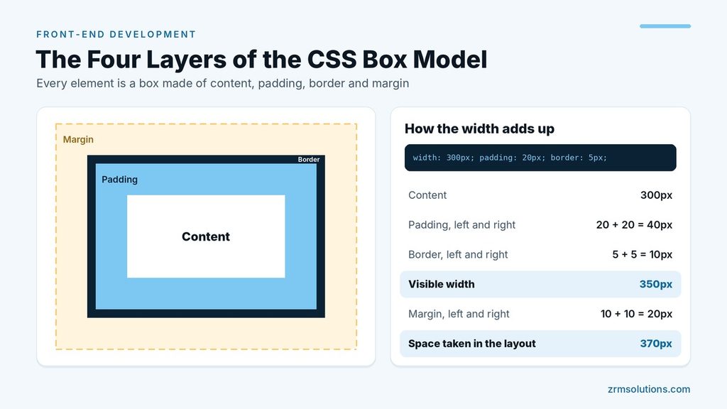
Every box has four layers. From the inside out:
- Content: the text or image itself. Its size is set with
widthandheight. - Padding: space between the content and the border. It shows the element’s background.
- Border: a line around the padding.
- Margin: space outside the border. It is always transparent and pushes other elements away.
.card {
  width: 300px;
  padding: 20px;
  border: 5px solid #333333;
  margin: 10px;
}
How Total Width and Height Are Calculated
By default, width sets the size of the content area only. Padding and border are added on top. Using the card above:
- Content: 300px
- Left and right padding: 20 + 20 = 40px
- Left and right border: 5 + 5 = 10px
- Visible width: 300 + 40 + 10 = 350px
- Left and right margin: 10 + 10 = 20px
- Space taken in the layout: 370px
Height follows the same sum with the top and bottom values. So a box you declared as 300px wide is 350px on screen, which is the cause of many broken layouts.
box-sizing: content-box vs border-box
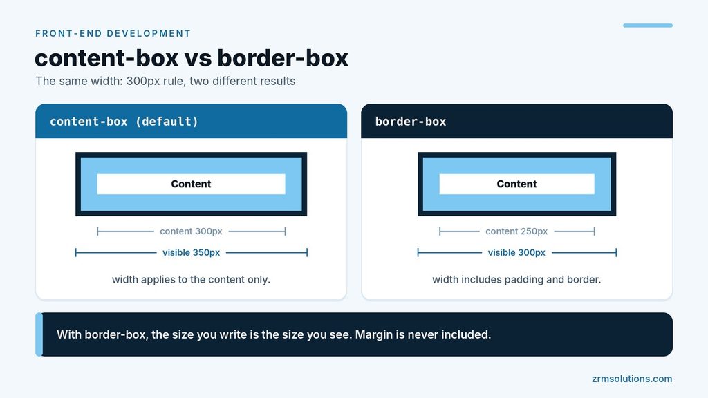
The box-sizing property changes what width and height mean.
| content-box (default) | border-box | |
|---|---|---|
width applies to | Content only | Content, padding and border together |
| Visible width of the card | 350px | 300px |
| Content area of the card | 300px | 250px |
With border-box, the size you write is the size you see. The padding and border are taken from the inside. Margin is never included in either mode.
Because this is easier to reason about, most projects start with this reset:
*,
*::before,
*::after {
  box-sizing: border-box;
}
Shorthand Values: One to Four
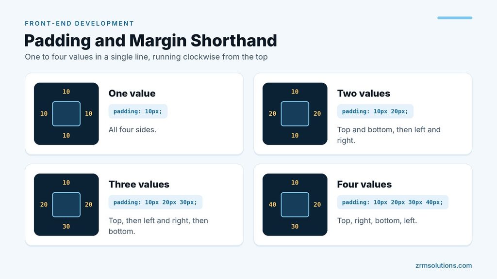
Padding and margin accept one to four values in a single line.
.box {
  padding: 10px;                 /* all four sides */
  padding: 10px 20px;            /* top and bottom, left and right */
  padding: 10px 20px 30px;       /* top, left and right, bottom */
  padding: 10px 20px 30px 40px;  /* top, right, bottom, left */
}
The four-value form runs clockwise, starting from the top. You can also set one side alone with properties such as margin-top or padding-left.
One shorthand is worth remembering: margin: 0 auto centers a block element horizontally, as long as it has a width.
Margin Collapsing
When the vertical margins of two block elements touch, they do not add up. They collapse into one margin, and the larger value wins.
h2 { margin-bottom: 30px; }
p  { margin-top: 20px; }
The gap between this heading and the paragraph is 30px, not 50px.
A few facts make collapsing predictable:
- It affects only top and bottom margins. Left and right margins never collapse.
- Padding and borders never collapse.
- It can happen between a parent and its first child. If nothing separates them, the child’s top margin ends up outside the parent.
- Margins of items inside flex and grid containers do not collapse.
How Block and Inline Boxes Behave Differently
The box model applies fully to block-level elements. Inline elements, such as span and a, follow different rules:
widthandheightare ignored.- Left and right padding and margin work as expected.
- Top and bottom margin have no effect.
- Top and bottom padding are drawn, but they do not push other lines away, so they can overlap the text above and below.
If you need an element to stay in a line of text and still respect every box property, use inline-block.
.tag {
  display: inline-block;
  padding: 6px 12px;
  margin: 4px;
}
Overflow: When Content Is Bigger Than Its Box
If a box has a fixed size and its content does not fit, the overflow property decides what happens.
visible: the default. Content spills outside the box.hidden: the extra content is cut off.scroll: scrollbars are always shown.auto: scrollbars appear only when they are needed.
.message-list {
  height: 200px;
  overflow: auto;
}
Outline vs Border
An outline looks like a border, but it is not part of the box model. It is drawn outside the border and takes up no space, so adding or removing one never moves other elements.
There are two other differences. A border can be set on each side separately, while an outline always surrounds the whole element. Browsers also use an outline to show which element has keyboard focus, so do not remove it unless you provide another clear focus style.
To check any of these values on a real page, inspect the element in your browser’s developer tools, which show a diagram of its content, padding, border and margin.
Width, max-width and Percentages
A fixed width looks fine on a large monitor and breaks on a phone. A box that is told to be 700px wide stays 700px wide, even when the screen is only 400px, so the page scrolls sideways.
The usual answer is max-width. It sets an upper limit and lets the box shrink when there is less room.
.article {
  max-width: 700px;
  margin: 0 auto;
  padding: 0 16px;
}
On a wide screen the article is 700px and centered. On a narrow screen it fills the space available, and the side padding keeps the text away from the edge of the screen. min-width works the other way and stops a box from becoming too narrow to use.
Percentages need one piece of background knowledge. A percentage width is measured against the width of the parent element. Percentage padding and margin are measured against the parent’s width too, and that includes the top and bottom values. So padding-top: 10% is ten percent of the parent’s width, not its height.
A Worked Example: Sizing a Card
Numbers make the CSS box model easier to trust. Here is a card that uses border-box.
.card {
  box-sizing: border-box;
  width: 320px;
  padding: 24px;
  border: 1px solid #cccccc;
  margin-bottom: 24px;
}- The visible width is 320px, exactly as written.
- The left and right padding use 24 + 24 = 48px.
- The left and right border use 1 + 1 = 2px.
- The content area is what remains: 320 – 48 – 2 = 270px.
- The bottom margin adds 24px of empty space below the card and does not change its size.
Remove the box-sizing line and the same rules give a different card. The content area becomes 320px and the visible width grows to 320 + 48 + 2 = 370px. Nothing else in the stylesheet changed, which is why an unexpected 50px of extra width is one of the first things to check when a layout overflows.
How to Stop Margin Collapsing When You Do Not Want It
Margin collapsing is helpful in running text, because paragraphs and headings do not end up with double gaps. It is less welcome when a child’s margin escapes from its parent. There are several reliable ways to prevent it.
- Add padding or a border to the parent. Collapsing between a parent and its first child only happens when nothing separates their margins. Even 1px of padding is enough.
- Use display: flow-root on the parent. This value exists for exactly this job. The parent contains its children’s margins and nothing else about it changes.
- Make the parent a flex or grid container. Margins of flex and grid items never collapse.
- Use gap for spacing. Inside a flex or grid container, gap adds space between items without any margins at all.
- Space elements in one direction. If every block uses margin-bottom and none uses margin-top, two margins never meet.
Borders, Rounded Corners and Shadows
The border is the only layer of the CSS box model with a style of its own. The shorthand takes three values: a width, a style and a color.
.note {
  border: 2px solid #1a73e8;
  border-radius: 8px;
  box-shadow: 0 2px 8px rgba(0, 0, 0, 0.15);
}
The style value is required. The default border style is none, so a rule such as border: 2px blue draws nothing. If a border refuses to appear, a missing style is the usual reason.
border-radius rounds the corners of the box. The background is clipped to the rounded shape, and the rule works even when the element has no border.
box-shadow draws a shadow around the box. Like an outline, a shadow takes up no space, so adding one never pushes neighboring elements away. That makes it a safe way to lift a card off the page.
Where the Background Is Painted
An element’s background color or image fills the content area and the padding, and it also runs underneath the border. You can see this with a dashed border, where the background shows through the gaps.
The background never reaches the margin. This gives a simple rule for choosing between padding and margin: if the extra space should share the element’s background, use padding. If it should be empty and show whatever is behind the element, use margin.
Padding is also part of the clickable area of a link or a button, and margin is not. Larger padding makes a button easier to tap on a phone. A larger margin only moves it away from its neighbors.
The CSS Box Model Inside Flexbox and Grid
Modern layouts are built with Flexbox and Grid, and the CSS box model still applies to every item inside them. Each flex or grid item keeps its own content, padding, border and margin.
A few details change:
- Margins of flex and grid items do not collapse, so two margins of 20px leave a 40px gap.
- gap is usually a cleaner way to space items than padding and margin on each one.
- With border-box, a flex item’s flex-basis includes its padding and border, just as width does.
- Auto margins take up free space inside a flex container, which makes it easy to push one item to the far side.
Learning the box first pays off here. Layout systems decide where the boxes go, and the box model decides how big each one is.
Inspecting the Box Model in Developer Tools
Every modern browser can show you the layers of any element on any page.
- Right-click the element and choose Inspect.
- Hover over the element in the HTML panel. The browser highlights its content, padding, border and margin on the page in different colors.
- Look for the box model diagram. In Chrome and Edge it is in the Computed tab, and in Firefox it is in the Layout tab.
The diagram is a set of nested rectangles. The content size sits in the middle, with the padding, border and margin values around it. If a box is larger than you expected, the diagram shows which layer the extra pixels come from.
You can also switch a declaration off with its checkbox in the styles list and watch the page change. Turning box-sizing on and off this way is a quick lesson in the difference between content-box and border-box.
Common CSS Box Model Mistakes
Using width: 100% together with padding. With the default content-box, the padding is added to the full width and the box overflows its parent. Switch to border-box and it fits.
Setting a fixed height on a box that holds text. Text grows when the screen narrows or the user increases the font size, and it then spills out of the box. Use min-height, or let padding create the space.
Sizing an inline element. width, height and vertical margin have no effect on a span or a link. Change the element to inline-block or block first.
Expecting vertical margins to add up. Two touching margins of 30px and 20px leave a 30px gap, not 50px.
Using margin for inner space. Margin sits outside the border, so it does not show the background and does not enlarge the clickable area. Inner space is a job for padding.
Leaving the border style out. Without solid, dashed or another style, no border is drawn.
CSS Box Model Cheat Sheet
- Space inside the border: padding
- Space outside the border: margin
- Make width include padding and border: box-sizing: border-box
- Center a block horizontally: a width or max-width plus margin: 0 auto
- Limit the width on large screens: max-width
- Stop a child’s margin escaping its parent: display: flow-root on the parent
- Keep content inside a fixed box: overflow: auto
- Let an inline element take width and height: display: inline-block
- Add a focus ring or shadow without moving anything: outline or box-shadow
Frequently Asked Questions
What is the difference between padding and margin?
Padding is space inside the border, between the border and the content, and it shows the element’s background. Margin is space outside the border, between the element and its neighbors, and it is always transparent.
Why is my element wider than the width I set?
Margin can be negative, which pulls an element toward its neighbor or lets it overlap. Padding cannot be negative.
Should I always use border-box?
For most projects, yes. It makes the declared width match the visible width, so adding padding or a border no longer changes the size of an element.
Why is my element wider than the width I set?
By default, width covers the content area only, so padding and border are added on top of it. A box declared as 300px wide with 20px of padding and a 5px border is 350px on screen. Set box-sizing: border-box and the declared width will include the padding and border, so the element stays at 300px. This is the usual fix when a layout overflows its container by a few pixels.
Final Thoughts
The CSS box model comes down to four layers and one sum: content, padding, border and margin. Set box-sizing: border-box, remember that vertical margins collapse, and the sizes on screen will match the numbers in your stylesheet.
Related reading
- CSS Basics for Front-End Development
- CSS Flexbox Explained
- Browser Developer Tools Explained
What is the default value of box-sizing?
The default is content-box, which means width and height apply to the content area only. Most projects change it to border-box for every element with a short reset at the top of the stylesheet.
Does margin count as part of an element’s size?
No. Margin is outside the border, so it is never included in the width or height, whichever box-sizing value you use. It still takes up room in the layout, because it pushes other elements away.
Why is there a small gap under my image?
An image is an inline element by default, so it sits on the text baseline, and the browser leaves room below the line for letters such as g and y. Setting display: block on the image removes the gap.
What does margin: auto do?
On a block element with a set width, auto margins on the left and right share the leftover space equally, which centers the box. Auto margins on the top and bottom do nothing in normal page flow, so this trick does not center vertically.