

Lining elements up in a row, spacing them evenly and centering them used to require awkward workarounds. CSS Flexbox, short for the Flexible Box Layout, was created to make exactly those jobs simple. It arranges items along a single line, either a row or a column, and lets them grow, shrink and align with a few properties.
This guide explains the container, the items and the two axes, then finishes with three patterns you can copy into a real project.
Table of Contents
What Problem Does CSS Flexbox Solve?
Before Flexbox, developers built layouts with floats, tables and other tricks that were never designed for the job. Centering something vertically or making columns the same height took extra code and often broke.
Flexbox handles these cases directly. It distributes free space between items, aligns them in both directions and adapts when the container changes size.
It is a one-dimensional system, which means it works on one row or one column at a time. For layouts that control rows and columns together, see the article CSS Grid Layout Explained.
Flex Container and Flex Items
Flexbox always involves two roles: a parent and its children.
<div class="container">
  <div>One</div>
  <div>Two</div>
  <div>Three</div>
</div>
.container {
display: flex;
}Setting display: flex turns the parent into a flex container. Its direct children become flex items. Deeper descendants are not affected.
With that one line, the three boxes sit side by side in a row and stretch to the same height.
Main Axis and Cross Axis
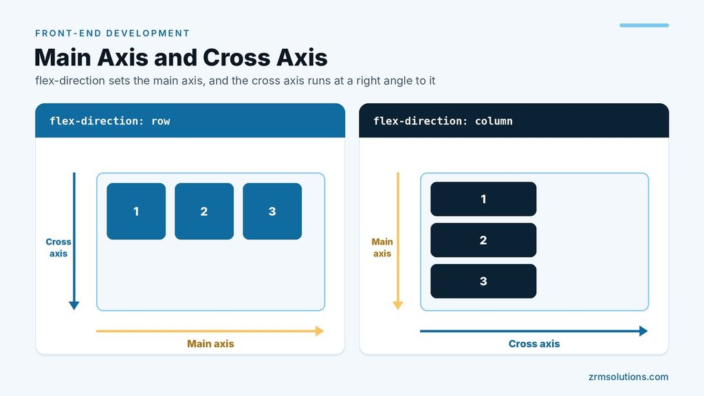
Every flex container has two axes, and nearly every Flexbox property refers to one of them.
- The main axis is the direction the items flow in.
- The cross axis runs at a right angle to it.
The flex-direction property sets the main axis. Its values are row (the default), row-reverse, column and column-reverse.
In a row, the main axis is horizontal and the cross axis is vertical. In a column, they swap. This explains a common confusion: justify-content moves items horizontally in a row but vertically in a column, because it always follows the main axis.
Container Properties
These properties go on the flex container.
| Property | What it controls | Common values |
|---|---|---|
flex-direction | Direction of the main axis | row, column |
justify-content | Spacing along the main axis | flex-start, center, flex-end, space-between, space-around, space-evenly |
align-items | Alignment on the cross axis | stretch, flex-start, center, flex-end, baseline |
flex-wrap | Whether items may move to a new line | nowrap, wrap |
gap | Space between items | Any length, such as 16px |
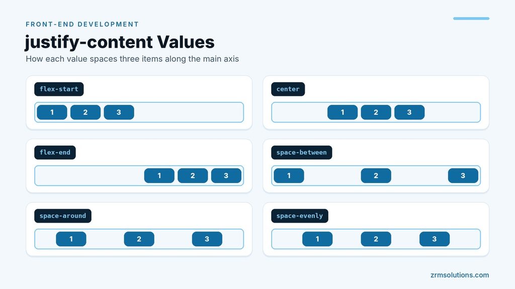
A few details are worth knowing:
flex-wrapdefaults tonowrap, so items shrink to stay on one line. Withwrap, items that do not fit move to the next line.align-itemsdefaults tostretch, which is why items in a row share the same height.gapadds space only between items, never on the outer edges of the container.
Item Properties
These properties go on individual flex items.
flex-growsets how much of the leftover space an item takes. The default is0, meaning it does not grow.flex-shrinksets how readily an item shrinks when space runs out. The default is1. A value of0stops it from shrinking.flex-basissets the starting size of an item before any growing or shrinking. The default isauto, which uses the item’s width or its content.flexis the shorthand for all three, in the order grow, shrink, basis.align-selfoverrides the container’salign-itemsvalue for one item.orderchanges where an item appears. The default is0, and lower numbers come first.
.sidebar {
  flex: 0 0 240px;
}

.content {
  flex: 1;
}
Here the sidebar stays fixed at 240px: no growing, no shrinking. The content area uses flex: 1, which lets it grow to fill all the remaining space.
A caution about order: it changes only the visual position. Keyboard navigation and screen readers still follow the order in the HTML, so use it sparingly.
Three Practical CSS Flexbox Patterns
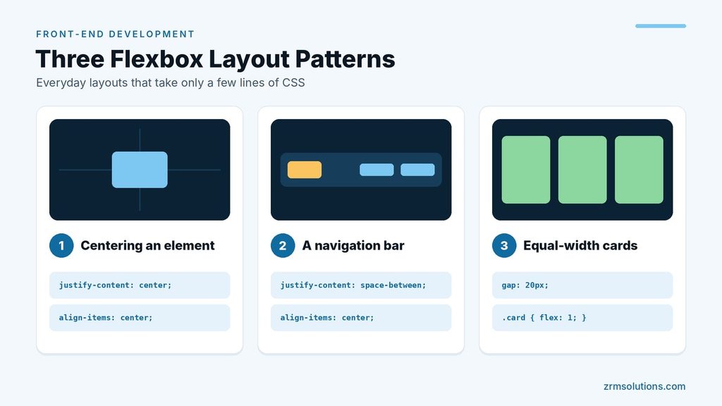
1. Centering an element
.hero {
  display: flex;
  justify-content: center;
  align-items: center;
  min-height: 300px;
}
justify-content centers the child on the main axis, and align-items centers it on the cross axis. The container needs some height, or there is no vertical space to center in.
2. A navigation bar
<nav class="navbar">
  <a href="/">Logo</a>
  <div class="nav-links">
    <a href="/menu">Menu</a>
    <a href="/contact">Contact</a>
  </div>
</nav>
.navbar {
display: flex;
justify-content: space-between;
align-items: center;
}
.nav-links {
display: flex;
gap: 24px;
}space-between pushes the logo to one side and the link group to the other. The link group is a flex container too, so its links sit in a row with an even gap.
3. Equal-width cards
.cards {
  display: flex;
  gap: 20px;
}

.card {
  flex: 1;
}
Every card receives an equal share of the row, whether there are two cards or five. To let the cards drop onto new lines in a narrow container, add flex-wrap: wrap to .cards and change the cards to flex: 1 1 250px.
How flex-grow, flex-shrink and flex-basis Work Together
These three properties answer one question: what should happen when the items do not fit the container exactly? CSS Flexbox works it out in three steps.
- Each item starts at its flex-basis size.
- If there is space left over, the items share it according to their flex-grow values.
- If there is not enough space, the items give some up according to their flex-shrink values.
A worked example makes this concrete. Picture a container that is 600px wide with three items, each with a basis of 100px.
.item { flex: 1 1 100px; }
.item.wide { flex: 2 1 100px; }
The three items need 300px, so 300px is left over. The grow values are 1, 1 and 2, which makes four shares of 75px each. The first two items become 175px wide and the wide item becomes 250px. Notice that the wide item is not twice the size of the others. It only receives twice as much of the leftover space.
Shrinking works the same way in reverse. Put two items with a basis of 300px into a 500px container and they are 100px too wide. With the default shrink value of 1, each gives up 50px and ends at 250px. Set flex-shrink: 0 on the first item and it keeps its full 300px, so the second item shrinks to 200px.
Three shorthand values cover most situations:
- flex: 1 means grow 1, shrink 1 and a basis of 0. Items ignore their content size and share the row equally.
- flex: auto means grow 1, shrink 1 and a basis of auto. Items start at their content size, then share what is left.
- flex: none means grow 0, shrink 0 and a basis of auto. The item stays at its natural size.
Wrapping Flex Items onto Several Lines
A flex container keeps everything on one line unless you tell it otherwise. Adding flex-wrap: wrap lets items move to a new line when they run out of room, which is how a row of cards turns into several rows on a small screen.
.tags {
  display: flex;
  flex-wrap: wrap;
  gap: 8px 12px;
}
When gap has two values, the first is the space between lines and the second is the space between items on the same line.
Once items wrap, one more property becomes useful. align-content controls how the lines themselves are spaced inside the container, using values such as center and space-between. It only works when flex-wrap is set to wrap, which is why it often seems to do nothing.
Each line in a wrapped container is laid out on its own. Free space is shared only among the items on that line, so if the items are allowed to grow, the last line may hold wider items than the lines above it.
Moving One Item with an Auto Margin
Sometimes a single item needs to sit apart from the rest, for example a “Log in” link at the far end of a menu. You do not need a second container for that. In CSS Flexbox, a margin set to auto takes up all the free space on that side of the item.
.menu {
  display: flex;
  gap: 16px;
}

.menu .login {
  margin-left: auto;
}
The other links stay grouped on the left, and the login link is pushed to the right edge. The same idea works vertically in a column: margin-top: auto pushes an item, such as a button at the bottom of a card, to the end of the container.
For alignment on the cross axis, use align-self on the item. It accepts the same values as align-items and changes only that one item.
Using CSS Flexbox in a Column
Most examples show rows, but CSS Flexbox is just as useful in a column. A common case is a card where the button should always sit at the bottom, however much text is above it.
.card {
  display: flex;
  flex-direction: column;
}

.card .text {
  flex: 1;
}
The text block grows to fill the spare height, which pushes the button down to the bottom edge. Put several of these cards in a row container and their buttons line up, because the cards stretch to the same height by default.
Remember that a column container only has free space to share if it is taller than its content. Give it a height or a min-height, or place it inside a row where it is stretched.
Common CSS Flexbox Mistakes and How to Fix Them
Most Flexbox problems come from a small set of causes.
Putting a property on the wrong element. justify-content, align-items, flex-wrap and gap belong on the container. flex, align-self and order belong on the items. A container property written on an item is simply ignored.
Forgetting that only direct children are flex items. If your cards sit inside an extra wrapper, the wrapper is the flex item and the cards inside it are not affected. Either remove the wrapper or make it a flex container as well.
Long content that refuses to shrink. By default, a flex item will not shrink below the size of its content, so a long word, a wide image or a code sample can push the layout wider than the screen. Adding min-width: 0 to the item allows it to shrink, and the content can then wrap or scroll.
Images that stretch. Because align-items defaults to stretch, an image placed directly in a row container can be stretched to the height of the row. Set align-items: flex-start on the container, or align-self: flex-start on the image, to keep its proportions.
Expecting equal columns from flex: auto. With a basis of auto, items with more content end up wider. Use flex: 1 when the columns should be the same width whatever they contain.
Using margins for spacing between items. Margins add space on the outer edges too and need extra rules to remove it. gap adds space only between items and is easier to maintain.
How to Debug a Flexbox Layout
When a layout does not behave, ask three questions in order.
- Which element is the flex container? Check that display: flex is on the parent of the items you are trying to move.
- Which way does the main axis run? In a row it is horizontal, and in a column it is vertical, which swaps the jobs of justify-content and align-items.
- Is there any free space? Alignment properties only move items when the container is larger than its content.
The browser can show you the answers. In the developer tools of Chrome, Edge and Firefox, a small “flex” badge appears next to every flex container in the HTML panel. Clicking it draws an overlay on the page that outlines each item and shows the space between them, so you can see where the extra room is going.
A quick manual trick also helps: give the container and its items a temporary outline in different colors. Outlines do not take up space, so they show the real size of every box without changing the layout.
CSS Flexbox Cheat Sheet
Keep this short list nearby while you practice.
- Put items in a row: display: flex
- Stack items in a column: flex-direction: column
- Center on both axes: justify-content: center and align-items: center
- Push the first and last items to the edges: justify-content: space-between
- Add space between items: gap: 16px
- Let items wrap onto new lines: flex-wrap: wrap
- Make items share space equally: flex: 1 on each item
- Keep one item at a fixed size: flex: 0 0 240px
- Push one item to the far end: margin-left: auto
- Align a single item differently: align-self
Frequently Asked Questions
Is Flexbox supported in all browsers?
Yes. All modern browsers support Flexbox, including the gap property, so you can use it without special prefixes.
Why is justify-content not doing anything?
It needs free space on the main axis. If the items already fill the container, or the container is only as big as its content, there is nothing to distribute. This often happens in a column layout with no set height.
When should I use Flexbox instead of Grid?
Yes. Any flex item can have display: flex and lay out its own children. The navigation bar above uses this approach for the link group.
What does flex: 1 mean?
It is shorthand for flex-grow: 1, flex-shrink: 1 and flex-basis: 0. The item is allowed to grow and shrink, and it starts from zero width, so several items with flex: 1 divide the row into equal parts.
What is the difference between align-items and align-content?
align-items positions the items inside their line on the cross axis. align-content positions the lines themselves inside the container, and it only applies when flex-wrap is set to wrap. For a single row of items, align-items is the one you need.
Is CSS Flexbox good for a whole page layout?
It can handle simple pages, such as a header, a content area and a footer stacked in a column. For layouts that need rows and columns to line up together, CSS Grid is usually the cleaner choice, with CSS Flexbox used inside each section.
Should I learn floats before CSS Flexbox?
No. Floats are still useful for wrapping text around an image, which is what they were designed for, but they are no longer needed for page layout. Beginners can go straight to CSS Flexbox and Grid.
Use Flexbox when you are arranging items in one direction, such as a navigation bar, a row of buttons or a group of cards. Use Grid when the layout needs rows and columns that line up with each other, such as a full page layout or a photo gallery. The two work well together, so many pages use Grid for the overall structure and Flexbox inside each section.
Final Thoughts
Flexbox comes down to one container, its direct children and two axes. Once you know which axis a property works on, centering, spacing and equal columns each take only a few lines of CSS.
Related reading
- CSS Grid Layout Explained
- Understanding the CSS Box Model
- Responsive Front-End Development