

Many beginners design a full desktop page first and then try to squeeze it onto a phone. Mobile-first web development turns that order around: you design and code the small-screen version first, then add to it as the screen gets bigger.
It is a strategy, a way of deciding what to build first and what to add later. This article explains the thinking behind it and gives you a workflow to follow on your next project.
If you are new to the topic, start with our guide on what front-end development is.
Table of Contents
What Is Mobile-First Web Development?
In a mobile-first project, the base styles (the CSS outside any media query) describe the phone layout. Larger screens then receive extra rules layered on top.
The phone version is the foundation, not an afterthought. A small screen has room only for what matters, so starting there forces you to decide what the page is really for.
Mobile-First vs Desktop-First
The two approaches show up clearly in the CSS. Assume .cards is a grid container. A mobile-first stylesheet looks like this:
css
/* Base: small screens */
.cards { grid-template-columns: 1fr; }

@media (min-width: 800px) {
  .cards { grid-template-columns: repeat(3, 1fr); }
}
The desktop-first version starts from the other end:
css
/* Base: large screens */
.cards { grid-template-columns: repeat(3, 1fr); }

@media (max-width: 799px) {
  .cards { grid-template-columns: 1fr; }
}| Mobile-first | Desktop-first | |
|---|---|---|
| Base styles describe | Small screens | Large screens |
| Media queries use | min-width | max-width |
| Each query | Adds to a simple layout | Undoes a complex layout |
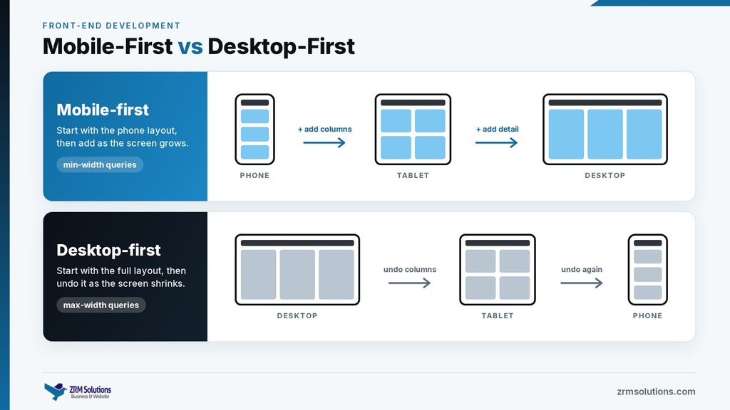
Both can produce the same result. The difference is direction: adding columns to a simple layout is usually easier than taking a complex one apart.
Progressive Enhancement
Mobile-first is one form of a wider idea called progressive enhancement. You start with a core that works everywhere: readable content, working links and usable forms. Then you add layers for devices that can handle more, such as multi-column layouts, hover effects and animations.
The opposite approach, graceful degradation, starts with the full experience and patches it for weaker devices. Building up is more reliable, because the basic version is never broken.
Prioritizing Content for Small Screens
A phone shows one column, so order matters more than anything else. Ask one question: what did the visitor come here to do? Put that first.
- Lead with the main heading, the key message and the main action.
- Move secondary material, such as related links, further down the page.
- Keep paragraphs short and subheadings clear.
- Ask for as few form fields as possible.
Reorder content, but do not remove it. If something is not worth showing on a phone, question whether it belongs on the page at all.
Touch-Friendly Design
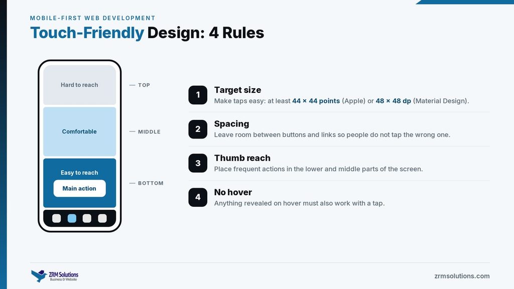
A fingertip is far less precise than a mouse pointer, and a touch screen has no hover state.
- Target size: make buttons and links large enough to tap. Apple’s guidelines suggest at least 44 by 44 points, and Google’s Material Design suggests 48 by 48 density-independent pixels.
- Spacing: leave room between targets so people do not tap the wrong one.
- Thumb reach: many people hold a phone in one hand and tap with the thumb. The lower and middle parts of the screen are easiest to reach, and the top corners are hardest. Place frequent actions where the thumb rests.
- No hover: anything revealed only on hover, such as a tooltip or dropdown, must also work with a tap.
Mobile Navigation Patterns
A full menu bar rarely fits on a phone. These patterns are common:
- Hamburger menu: a three-line icon that opens a hidden menu. It saves space, but the links are out of sight until someone taps it.
- Bottom navigation bar: three to five main destinations fixed at the bottom of the screen, within easy thumb reach.
- Priority menu: the most important links stay visible and the rest sit under a “More” button.
On wider screens the same links can open out into a normal horizontal bar.
Why Mobile-First Helps on Slow Connections
Phones are often used on slower, less stable networks and may have less processing power than a laptop. Starting from the phone keeps the base page lean: fewer large images, less decoration and less script to download and run.
Extras are then added only where the screen has room for them. The techniques themselves are covered in Front-End Performance Optimization.
Google’s Mobile-First Indexing
Google uses mobile-first indexing, which means it mainly looks at the mobile version of a page when it indexes and ranks that page. If the mobile version is missing text, headings or links that the desktop version has, Google may never count them. A site that serves the same HTML to every device and keeps its important content visible on small screens is already in good shape.
A Step-by-Step Mobile-First Workflow
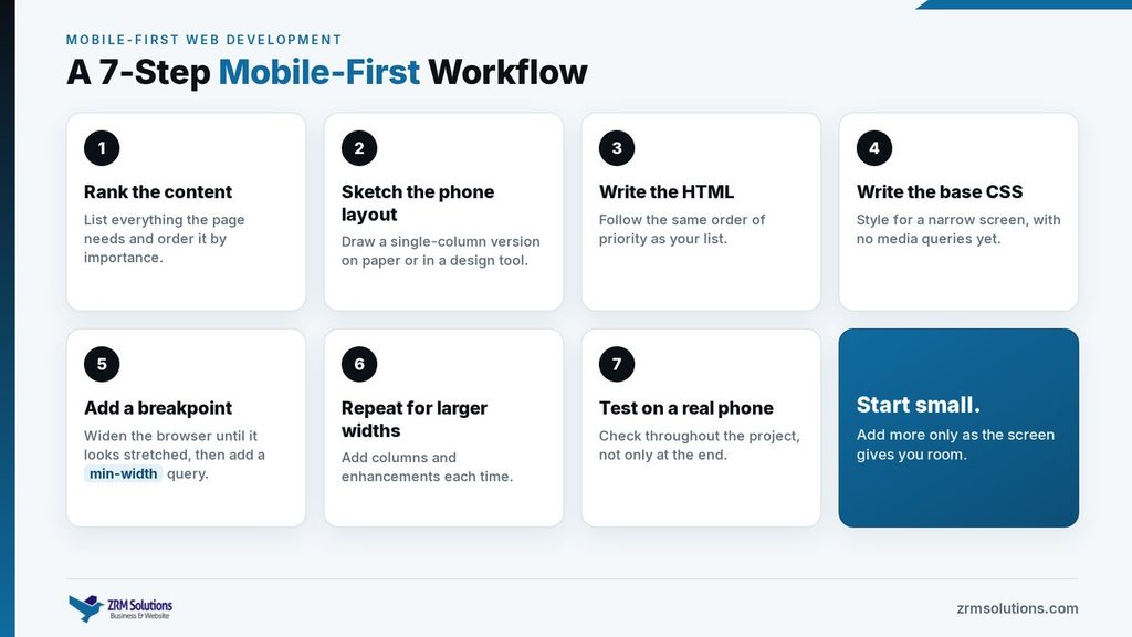
- List everything the page must contain and rank it by importance.
- Sketch the single-column phone layout on paper or in a design tool.
- Write the HTML in that order of priority.
- Write the base CSS for a narrow screen, with no media queries yet.
- Widen the browser until the layout looks stretched, then add a
min-widthquery at that point. - Repeat for larger widths, adding columns and enhancements each time.
- Test on a real phone throughout the project, not only at the end.
Frequently Asked Questions
Is mobile-first the same as responsive design?
No. Responsive design is the set of techniques that make a page adapt to the screen. Mobile-first is the order in which you apply them. A site can be responsive and still be built desktop-first.
Should I use mobile-first if most of my visitors are on desktops?
In most cases, yes, because the base styles stay simple. A complex tool used mainly at a desk can be designed desktop-first, as long as it stays usable on a phone.
Does mobile-first mean the desktop version will look plain?
No. Larger screens receive extra layout and visual detail through media queries.
Final Thoughts
Mobile-first is a habit of starting small: the most important content, the simplest layout and the lightest page, with everything else added as space allows. It leads to cleaner CSS and pages that work for the many people who browse on a phone.
Related reading
- Responsive Front-End Development
- Front-End Performance Optimization
- Website Accessibility in Front-End Development